RGB, ProPhoto RGB, colorimeters, color spaces… Photographers, photography blogs and magazines, everyone talks about color management these days. What is that all about? Is it really important? In this article we’ll try to find simple answers (indeed, when talking about color management, things can quickly get very complicated).
At the times of film photography, the photographer was not always responsible for the color management of his work. Indeed, different films had different color sensitivities, as well as photographic papers. Adjustments were possible in the darkroom for sure, but some elements that had an influence on the final colors of prints were just out of control. Then, if color accuracy was paramount, the photographer had to work with high end speciality labs and the results were, most of the time, partly obtained via trial and error.
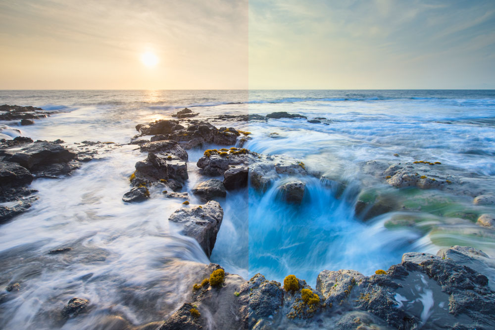
With digital photography, things have completely changed. Indeed, digital darkroom softwares allow the photographer to accurately control each and every setting from luminosity to contrast, and from color temperature to saturation and luminance. The problem is: colors, most of the time, do not automatically show on the computer monitor exactly as they are in the image file. Hence, images that are shared, via social media or anything else, may appear totally differently according to the settings of each monitor. Then, an image you spent hours fine tuning to make sure the best result is achieved may be totally ruined just because the settings of two monitors are different. And this is the exact same with printers. Which photographer never was disappointed when receiving the prints he ordered and realized that they didn’t look as they did on his computer?

Although most people can live with these differences in color rendering, serious amateur photographers as well as professionals simply cannot. But in order to make sure that colors are accurate from the image file in the camera to computer monitors and then to the final prints, everything needs to be calibrated. High end cameras can be calibrated, but it requires a lot of time and specific hardware. Since colors can be fine tuned in the digital darkroom, camera calibration is not a priority for most photographers. However, monitor calibration is paramount to ensure that final images are processed accurately and will display the way they are intended to on any other (calibrated) monitor or printer. Let’s have a look at what it takes to calibrate everything properly.
Color models and color spaces
Color models are abstract mathematical models describing the way colors can be represented. There are two main color models that are used nowadays:
- RGB: the RGB model is based on light, using the three primary colors (Red, Green, and Blue) to produce all the other colors. This is an additive model; adding a maximum of the three primary colors produces white. Cameras and monitors work on the RGB model.
- CMYK: the CMYK model is based on ink, using the primary colors of pigment (Cyan, Magenta, Yellow, and blacK) to produce all the other colors. This is a subtractive model; adding a maximum of the pigments produce black instead of white in the RGB model. The CMYK model is used in the printing industry.
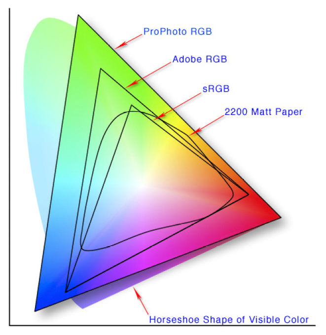
But, as stated above, color models are abstract and cannot work without dedicated color spaces. Color spaces are the mapping functions of colors models, i.e. the “units” that make the model work. The color model is like a ruler and the color space is the graduation system you choose. You can choose centimeters, millimeters, inches… The more graduations you have, the more different colors you can represent. Since cameras and monitors work in the RGB model, we’ll only discuss about spaces that are based on the RGB model here. Three main color spaces are used:
- sRGB: it was developed in 1996 by both HP and Microsoft for use on monitors and printers. The sRGB color space is the standard for the internet and is the most common for entry level cameras and scanners.
- Adobe RGB (1998): it was developed by Adobe Systems, Inc. in 1998. It was designed to cover most of the colors that can be achieved with a high end CMYK color printer by using RGB primary colors instead. It is wider than sRGB and is thus available for midrange and high end equipment. When images that were produced using Adobe RGB are to be shared on the internet, they need to be converted to the sRGB color space to make sure the colors will display correctly.
- ProPhoto RGB: the ProPhoto RGB color space was developed by Kodak. It is exceptionally wide, covering over 90 % of all possible surface colors of the International Commission of Illumination’s LAB color space (this is a reference color space that includes all perceivable colors and is basically used as a reference) while Abobe RGB covers around 50 %.

Which color space to choose?
Well… Most cameras offer sRGB or Adobe RGB. If your goal is to achieve the best possible results, then you should use the widest color space the possible in your camera and set your working space on your computer accordingly. But remember that you might need to convert your images to another color space afterwards – if you want to share it on social media for example, internet uses sRGB – to be sure that the colors will be displayed correctly.
If you take photos in RAW format however, the color space you set in camera doesn’t matter. Indeed, RAW files are what they are: raw. All the information the sensor captured is stored in the image file, and the color space is actually set in the RAW converter while working on your computer. Then, if you want to have the highest possibilities in terms of color control, you can set your whole working space to ProPhoto RGB.
Monitor calibration
Monitors are all different. Because of the manufacturers, the materials that are used to build them, the settings… But also because they simply age and that their settings drift over time. These changes are of different degrees and are extremely difficult to perceive, even with a trained eye.
There are basically two option to calibrate a monitor: calibration using visual elements or calibration using a dedicated device. But whatever option you choose, there are a few elements that must be checked before the actual calibration can take place:
- Check the ambient light: for accurate results, your workspace should be consistently lit with soft light and your monitor should not receive any reflections nor glare. Any window should be equipped with blinds.
- Check your monitor’s resolution: set it to default or recommended resolution if it was changed.
- Check your monitor’s color settings: set it to as high as possible to ensure the best results.
- Let your monitor warm up at least 30 minutes: colors on a cold monitor are not accurate.
Now that everything’s ready, the calibration can start.
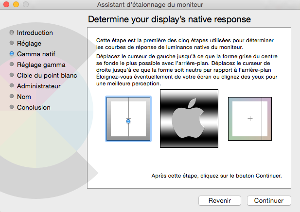
Calibration using visual elements is the cheapest option, but is not accurate at all. Some people suggest that you print one of your images on a professional, calibrated printer, then display the same image on your computer’s monitor, then make adjustments with the display management tool of your computer to make both images look the same… If you are taking colors seriously (and if you are still reading this article, I am sure you are), then this is just not an option. An alternative is to use a monitor calibration software that uses visual elements to guide you through the calibration process (like Calibrize, for instance). This is still not very accurate, but it’s better than nothing though (and better than the printed image option).

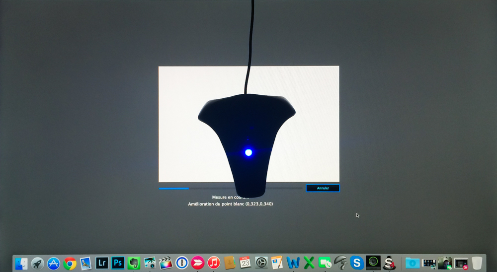
The only reliable option is to calibrate using a colorimeter. This is an electronic device that is placed on the monitor and that measures light and colors. It is connected to your computer (usually via USB) and comes with a dedicated software that displays a lot of different colors and makes progressive corrections according to the results of the colorimeter’s measurements. Once all adjustments are made and the colors display correctly, the software creates a custom profile for the display that the monitor will use instead of the standard profile. This is a very simple and accurate process.

The most common colorimeters come from either X-Rite or Datacolor. Both manufacturers have a wide range of devices, from entry level ones that allow you to calibrate a single monitor to high end colorimeters that manage calibration and synchronize multiple monitors, projectors, TV’s and more, and that even monitor ambient light and suggest corrections to your monitors’ brightness. Prices are, of course, very different. Entry level devices cost about $ 100 while high end ones can cost up to $ 1,000 and more. Usually, devices around $ 200 cover most photographer’s needs. As an example, I personally use Datacolor’s Spyder 4ELITE, which allows for advanced calibration options and costs around $ 250.
I strongly recommend to buy a colorimeter. I bought one after I was very disappointed with prints I ordered that did not come out the way they were supposed to… at all. Now that all my workflow is calibrated, I never have any problem anymore. Once you jump into color management, you never come back. But whatever option you eventually choose to calibrate your monitor, keep in mind that calibration needs to be checked every 2 to 4 weeks to ensure the best results over time. Most software that come with colorimeters have an option allowing you to set a reminder.
Enjoyed this? Share it!
Share this post with your friends: